Showing posts with label Tutorial. Show all posts

7.30.2014

Studio Calico Sandlot Kits: SQUINTS!

  Hi, guys!
 
If you haven't checked em out yet- make sure you run over and check out the new Sandlot Kits from Studio Calico! As soon as I heard the names of the kits this month, I knew I would be in love! I am a tried and true baseball mom and I've seen Sandlot more times than probably any other movie... lol!
 
http://tinyurl.com/mtsjzk2
 
 
Today I'm sharing a card I made with the Squints Card Add-on- still available in the shop!
 
http://tinyurl.com/ot5bpeu
 
I LOVE the stamps in this kit! And I really put them to use this month!
 
I was inspired by the fabulous Vanessa Menhorn and THIS card that she made- love how she stamped her floral background! I "lifted" her card for one of my projects in my gallery this month!
 
(You can see her full gallery HERE)
 
 
Here's how I made my card:
1. Gather supplies.
I grabbed some white cardstock, patterned paper, Versafine Onyx Black ink, stamps (from the Squints kit!), waterbrush, Peerless Transparent Watercolor Papers, and some tape.
 
2. Stamp your background.
I took three different sizes of the rose bud stamps and stamped them randomly to cover the card front.
 
3. Paint.
I chose three colors and watercolored over the stamped images.
 
4. Finishing touches.
I splattered some black paint, added a sentiment, and adhered the stamped sheet to a card base!


Thanks so much for the inspiration, Vanessa!
 
Thanks for stopping by! Check out the SANDLOT KITS before they're sold out- they're really great!


SHARE THIS POST - {PINTEREST}

6.27.2014

Studio Calico Release Day! FUNNEL CAKE!

  Happy Release Day, folks!
 
I'm here today to share some projects I created with my favorite thing from this month- the Funnel Cake stamps!
 
http://tinyurl.com/ldjvg2c
 
Now, the biggest question I've seen come up on the message boards about this stamp set is how to use it if you don't have an acrylic block big enough! This stamp is a big one- and I've heard lots of suggestions- but I thought I'd show you how I use large stamps like this WITHOUT a block!
 
It's easy peasy and works like a charm! Take a look:
1. Gather supplies.
You'll need the stamp, some ink (I used Versafine Onyx Black), cardstock, and a brayer. You could also just use your hands- would work fine, too!
 
2. Carefully peel the stamp off the packaging.
 
3. Stick your stamp to your desk stamp side up.
We're using our desks as the block!
 
4. Press down.
 Press down the stamp to make sure that it doesn't wiggle around at all.
You want it to be nice and secure on your desk.
 
5. Ink it up!
 Generously apply ink to the stamp to cover.
 
6. Carefully place your cardstock on top of the inked stamp.
This is where you have to be very careful- if that cardstock shifts, you won't have a nice image! Make sure to hold it down gently with one hand.
 
7. While holding the cardstock, gently roll over the cardstock and stamp with a brayer.
You can also just use your hands to gently press the paper onto the stamp, but I've found that I get a clearer, more crisp image with the brayer!
 
8. Carefully lift the paper off of the stamp.
Take your time and make sure not to drop the cardstock back down on the ink.
 
9. Admire your stamped image!
 
EASY, right!?
 
After stamping the image, I cut around the entire shape of the country and set out to make a card for my Project Life album. We're getting ready to take a road trip up to Delaware to visit family, so I thought this would be a great addition to help document the trip! I'll also be posting this on Instagram and Facebook to tell our family and friends that we'll see them soon! A fun little announcement of our trip!


I added these fun little stars (stamped with Emerald City Color Theory Ink) and connected them with a piece of embroidery floss!
 
The beautiful woodgrain paper is from the Penny Arcade 4x6 Paper Pad! I love that all of the patterns coordinate so well with the Penny Arcade Project Life Kit!
 
If you want this stamp and die set, you may have to be quick!
They will be available on the Studio Calico site HERE during the full reveal at midnight EST tonight! I have a feeling these will go very quickly- you don't want to miss it!

These are currently SOLD OUT! They will be restocked, though! You can PREORDER the stamp and die set now and it will ship to you as soon as the reorder arrives in the warehouse!

PREORDER HERE
 

SHARE THIS POST - {PINTEREST}

4.22.2014

Watercolor Stamping Tutorial

  HI!
 
I'm so glad you stopped by today!
 
I created a fun birthday card a couple of weeks ago using watercolors to stamp some peaches! I really liked how it turned out and have put together a quick step-by-step tutorial on how you can create a similar project!
 
 
I used the stamp set from the Bluegrass Farm Card Kit and the Peerless Transparent Watercolors to create this peach background. LOVE how the paint mixed together on the stamp before stamping- really gives a cool blended effect to the images! Here's a peek at how I did it:
 
 
These watercolor papers (Peerless Transparent Watercolors) are absolutely fabulous... If you haven't picked them up already- you definitely should! They're super easy and totally portable- LOVE the vibrant colors! They're my go-to watercolor paints!
 
http://tinyurl.com/clrd4k6


Stamping with watercolor paint gives you a really cool blended look- and it definitely helps you get more use out of your stamps!
 
 
Thanks for stopping by!

SHARE THIS POST - {PINTEREST}

3.30.2014

Tutorial: Masking and Ink Blending

  Hi!
 
I'm here today to share a card I created with the new Buttercup Stamp Set from Studio Calico!
 
I LOVE this stamp set and created a fun, one layer card using some easy masking and blending techniques.


Here's how I made it!


I gathered up a few supplies- the Buttercup stamp set, Color Theory inks (Deja Blue, Mint Hint, Coral Bay, and Clean Slate), Versafine Onyx Black ink, cardstock, an ink blending tool, and a mask. I created this square mask out of copy paper. I simply cut a square out using my Cameo!

1. Adhere the mask to the card front with repositionable tape. Stamp the star image repeatedly in different colors on the inside of the square mask.
 
2. I used the smaller star stamp to fill in any gaps. Stamp as much as you'd like!
 
3. Take your ink blending tool and tap it on an ink pad to cover it with a layer of gray ink.
 
4. Gently, lightly blend the gray ink inside the square. Apply the ink in a circular motion and cover completely.
 
5. Remove the mask!
 
6. Stamp the sentiment with black ink.
 
 
The result is a really fun focal image on a simple card!


 I hope you'll give this technique a try!
 
Thanks for stopping by!


SHARE THIS POST - {PINTEREST}

8.29.2012

tutorial: rock & roll stamping

  Good morning!
 
I have a quick little tutorial to share today! I'm going to show you how to achieve a soft, gradient look by using the rock & roll technique with your solid stamps!


Today I'm using the Two Step Butterfly stamp set and three blue pigment inks from A Muse Studio. These inks work beautifully to create a really soft look- if you want a more distinct color difference you can use dye inks for this technique! I wanted a soft pastel look for these butterflies so I chose pigment ink. Have fun with it and experiment to see what inks give you the look you want!


I started by inking the solid butterfly image with my lightest of three colors - Sky A Muse Studio pigment ink.


Then, I added some of my middle color - Blueberry A Muse Studio pigment ink - by hovering my stamp right above the ink pad and gently rocking and rolling the stamp onto the ink. The ink is distributed more heavily towards the outer edges of the stamp leaving the center light blue.


I repeated this process with the darkest of the three colors - Navy A Muse Studio pigment ink - concentrating the darker colors along the outer edge of the butterfly wings.

You can see in the background that some of the lighter ink transferred to my darker ink pads. Not a huge concern at all- I simply rub the whole ink pad on a sheet of scrap paper when I'm finished and that layer of lighter ink comes right off!


After stamping a couple butterflies using the rock & roll technique, I added some of the outline butterfly stamp to create movement on my card. I think this panel makes it look like the butterflies are flying from the bottom left up to the top right.


I added a rock & roll butterfly (that I cut out with scissors) to the panel to add some dimension. I think it looks really cool- like the butterfly is taking flight off of the card!


Here's the finished card! I added a sentiment from Growth and some pearls on the top butterfly to pull it all together. I love the soft look of the butterflies!
 
I created this card for the Movement Challenge in the Moxie Fab World! I hope you'll run over and check out the challenge- LOTS of great information about design for you to soak up!


SHARE THIS POST - {PINTEREST}

10.28.2011

Tutorial: Distress Stain Resist (3 ways!)

 Who LOVES Distress Stains!? I DO! 

I'm here today to show you how to use Distress Stains and Emboss Resist to create three VERY different looks- same technique, just very different ways to use it!

Today I'm going to show you 
Distress Stain Resist, Distress Stain Resist with Perfect Pearl Mist
and Distress Stain Resist Watercoloring. 
Enjoy!


Distress Stain Resist

This is the most basic of the techniques I'm going to show you today- super easy, but creates a really pretty color pattern that you can use as a main focal element on your cards or even on scrapbook layouts! I love to sit and play around with different color stains to create beautiful patterns- so much fun!

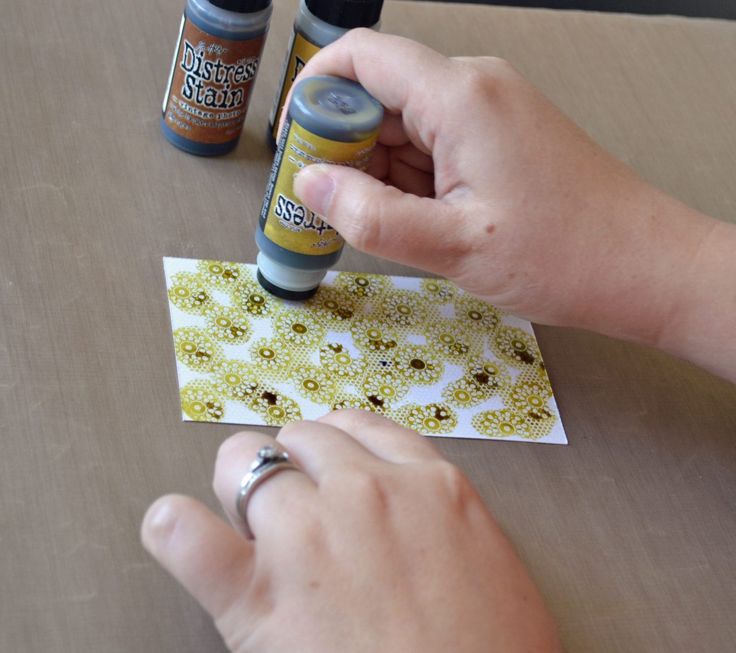
First, I started by heat embossing the Sweet Lace background with clear embossing powder on white cardstock. Then, I chose a couple different Distress Stains and went to work! The Stains I used on this card are Crushed Olive, Scattered Straw, and Vintage Photo (full list of supplies at the bottom of the post).

Add color in any pattern you wish, mixing and blending the colors around until you have the look you want! I started with Crushed Olive, adding it in small circles where the circles in the background pattern are.

Then I went in and filled the spaces with Scattered Straw. Finally, I added bits of Vintage Photo here and there to complete the look! 

When you're finished adding your Distress Stains, you can either leave it to dry or dry it with a heat tool.

And here's the final product. If you wanted a more blended look, you could mist it with some water before heat setting!


AND... here's the card I made: 

Perfect for fall- I added the sentiment "Autumn Greetings" from the Autumn Greetings set on the inside!


Distress Stain Resist with Perfect Pearl Mist


This next technique is basically the same technique as the first, only the finished product is a sparkly, pretty blend of colors! For this one, I started by heat embossing the Zebra Print background with clear embossing powder on white cardstock. Then, I chose a couple different Distress Stains and went to work! The Stains I used on this card are Weathered Wood, Broken China, and Faded Jeans (full list of supplies at the bottom of the post).


Add color in any pattern you wish, mixing and blending the colors around until you cover the paper and have the look you want!

Next, spray the entire sheet with Perfect Pearls Mist. Ensure that you spray enough to achieve a nice blend of the colors and get a pretty shimmer!

Wipe the excess Perfect Pearls Mist and Stain from the embossed area with a  damp towel.

Leave to dry or dry quickly with a heat tool!


And here's the card I made with this pretty, sparkly background:

Same layout for this card, but a TOTALLY different effect! This is perfect for a fun card to send to a girlfriend! I completed it by stamping the "Celebrate" sentiment from Celebrate Cake on the inside.


Distress Stain Resist Watercoloring

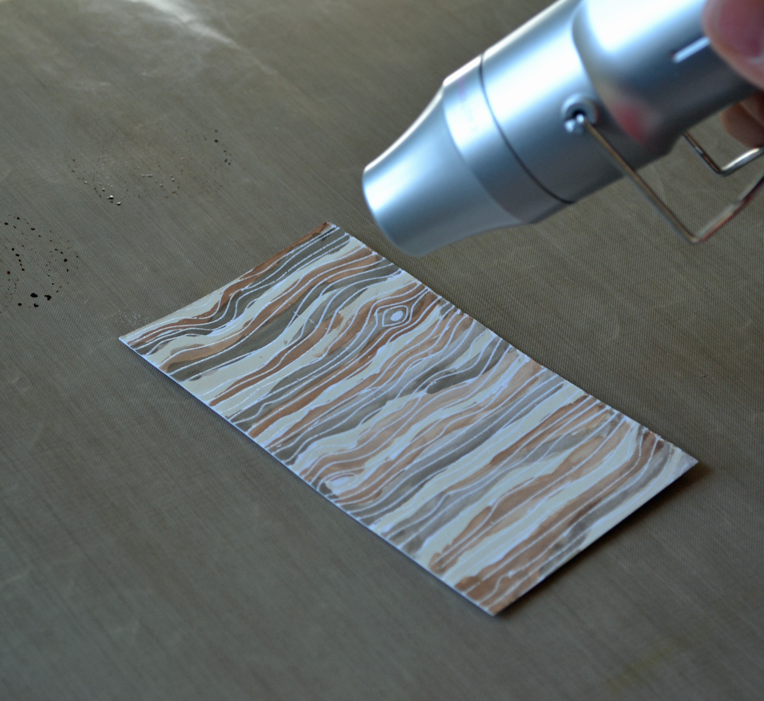
This final technique I'm going to show you is very different from the other two! For this one, I started by heat embossing the Woodgrain background with clear embossing powder on white cardstock. Then, I chose a couple different Distress Stains and watercolor painted them using my Aqua Painter! You can totally use a regular paint brush and water for this technique- I just happen to have an Aqua Painter, which makes this technique really easy. The Stains I used on this card are Antique Linen, Vintage Photo, and Walnut Stain (full list of supplies at the bottom of the post).


I started by applying some Distress Stain directly to my craft sheet in the three colors I chose to use.

Then, I used my Aqua Painter to pick up some Stain to paint on my embossed cardstock.

I added all three colors in stripes across the embossed paper, creating a fun, watercolored woodgrain look! I love how the stains blend together and and create this soft pattern!

Finally, either leave the paper to dry or dry it quickly with a heat tool.

And here's the card I made:


Same layout, just turned around a bit! LOVE this look and I'll definitely be using this technique again soon! On the inside I stamped the sentiment "Thank You" from the Hippie Chic set!

I hope I have inspired you to try Distress Stains and play around to discover new looks and styles! It is really fun to just get a little inky and play around!


{Distress Stain Resist} Supplies:


{Distress Stain Resist with Perfect Pearl Mist} Supplies:


{Distress Stain Resist Watercoloring} Supplies:


SHARE THIS POST - {PINTEREST}
 
SITE DESIGN BY DESIGNER BLOGS