Good morning!
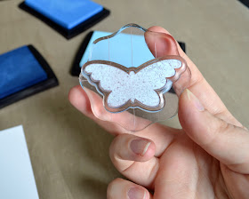
I have a quick little tutorial to share today! I'm going to show you how to achieve a soft, gradient look by using the rock & roll technique with your solid stamps!
Today I'm using the Two Step Butterfly stamp set and three blue pigment inks from A Muse Studio. These inks work beautifully to create a really soft look- if you want a more distinct color difference you can use dye inks for this technique! I wanted a soft pastel look for these butterflies so I chose pigment ink. Have fun with it and experiment to see what inks give you the look you want!
I started by inking the solid butterfly image with my lightest of three colors - Sky A Muse Studio pigment ink.
Then, I added some of my middle color - Blueberry A Muse Studio pigment ink - by hovering my stamp right above the ink pad and gently rocking and rolling the stamp onto the ink. The ink is distributed more heavily towards the outer edges of the stamp leaving the center light blue.
I repeated this process with the darkest of the three colors - Navy A Muse Studio pigment ink - concentrating the darker colors along the outer edge of the butterfly wings.
You can see in the background that some of the lighter ink transferred to my darker ink pads. Not a huge concern at all- I simply rub the whole ink pad on a sheet of scrap paper when I'm finished and that layer of lighter ink comes right off!
After stamping a couple butterflies using the rock & roll technique, I added some of the outline butterfly stamp to create movement on my card. I think this panel makes it look like the butterflies are flying from the bottom left up to the top right.
I added a rock & roll butterfly (that I cut out with scissors) to the panel to add some dimension. I think it looks really cool- like the butterfly is taking flight off of the card!
Here's the finished card! I added a sentiment from Growth and some pearls on the top butterfly to pull it all together. I love the soft look of the butterflies!
I created this card for the Movement Challenge in the Moxie Fab World! I hope you'll run over and check out the challenge- LOTS of great information about design for you to soak up!


Pretty...thanks for sharing...love it..
ReplyDeleteLove, love, LOVE that vibrant blue, Steph! This is one of my favorite techniques! TFS! And that picture of your boys, on their first day of school, in your previous post, is beyond adorable! You're one lucky girl ;)!
ReplyDeleteOh I love how you did 3 SHADES!!!!
ReplyDeleteThis is really pretty! The popped up panel looks great under the sentiment banner!
ReplyDeleteReally cool card!
ReplyDeleteHey Stephanie! Thanks for linking this up to the Movement Challenge in the Moxie Fab World! I'm so glad you joined in on all the fun! :)
ReplyDelete